freddy
Well-known member
- Location
- Sweden
Hello!
As said. Great work with the forum. Looks really really good.
I found some small thing, that I just think might be worth having a look at. A bit on a personal taste you can decide if you think they're worthy or not .
.
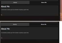
1. Profile text no padding
Feel some padding should do good so the text isn't so close to the border.
Suggested fix:
.ipsType_pageTitle {
padding: 5px;
}
.ipsType_normal.ipsType_richText {
padding: 5px;
}
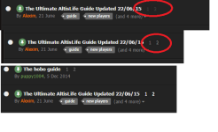
2. Paginator hard to see.
For me it's a bit hard to see if there's a paginator on a topic, and a bit hard even when you hover. Might be my eyes/screen tricking me though.
Suggested fix (may need some playing around with)
.ipsPagination.ipsPagination_mini a {
color: #fff;
}
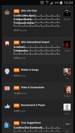
3. Create new topic (drop down on Create button in top).
For me this text is also a bit hard to see, and might feel a bit better to make the text darker.
Unfortunately I did not get by to find a clear fix for it. That component seems just a little bit more tricky but happy to have a deeper look at it if you're interested.
Do note that I didn't test if the fixes had impact on any other components on the forum!


As said. Great work with the forum. Looks really really good.
I found some small thing, that I just think might be worth having a look at. A bit on a personal taste you can decide if you think they're worthy or not
1. Profile text no padding
Feel some padding should do good so the text isn't so close to the border.
Suggested fix:
.ipsType_pageTitle {
padding: 5px;
}
.ipsType_normal.ipsType_richText {
padding: 5px;
}
2. Paginator hard to see.
For me it's a bit hard to see if there's a paginator on a topic, and a bit hard even when you hover. Might be my eyes/screen tricking me though.
Suggested fix (may need some playing around with)
.ipsPagination.ipsPagination_mini a {
color: #fff;
}
3. Create new topic (drop down on Create button in top).
For me this text is also a bit hard to see, and might feel a bit better to make the text darker.
Unfortunately I did not get by to find a clear fix for it. That component seems just a little bit more tricky but happy to have a deeper look at it if you're interested.
Do note that I didn't test if the fixes had impact on any other components on the forum!
