What's new
Roleplay UK

Join the UK's biggest roleplay community on FiveM and experience endless new roleplay opportunities!

Police clothing discolouration

Status
Not open for further replies.

Phoenix

John!
Staff Team
Elite Donator
Los Santos Police
Los Santos Police Trainer
Judge
Location
Weazel News HQ
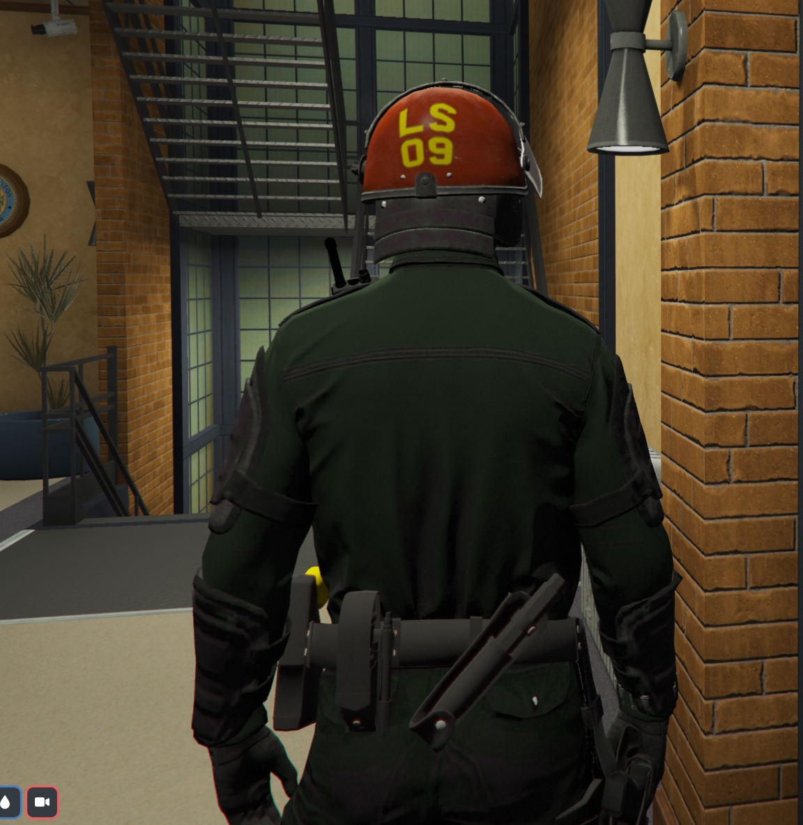
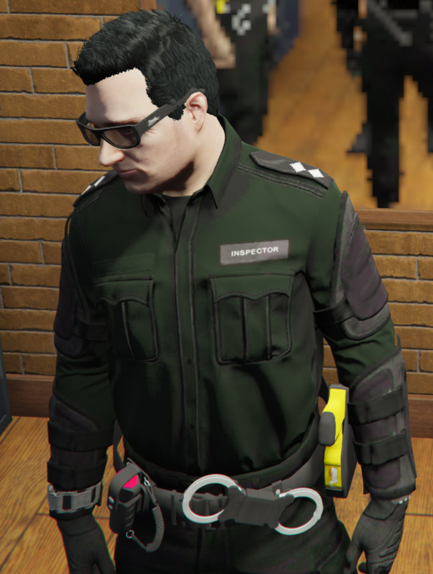
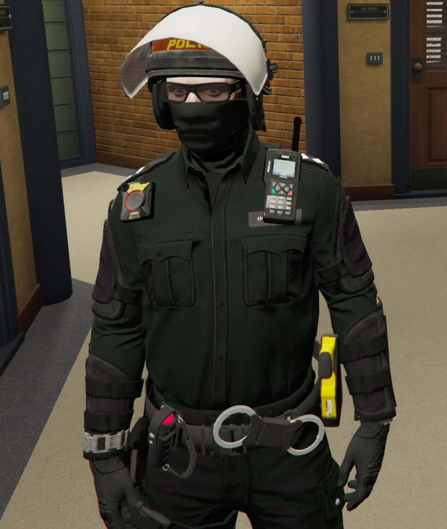
Certain pieces of police uniform have been discoloured so far (presumably by incredibly overzealous compression) that it's completely changed how it looks.

PSU Uniform:

The PSU Uniform is green, instead of the black it is meant to be. Comments about this from others date back to October last year (https://discord.com/channels/148409679570141184/1008024725081030777/1036749159199412344)
CompleteKatydid%F0%9F%92%A3.png


FriendlyComet%F0%9F%90%9C.png
EveryFluke%F0%9F%8D%9E.jpg


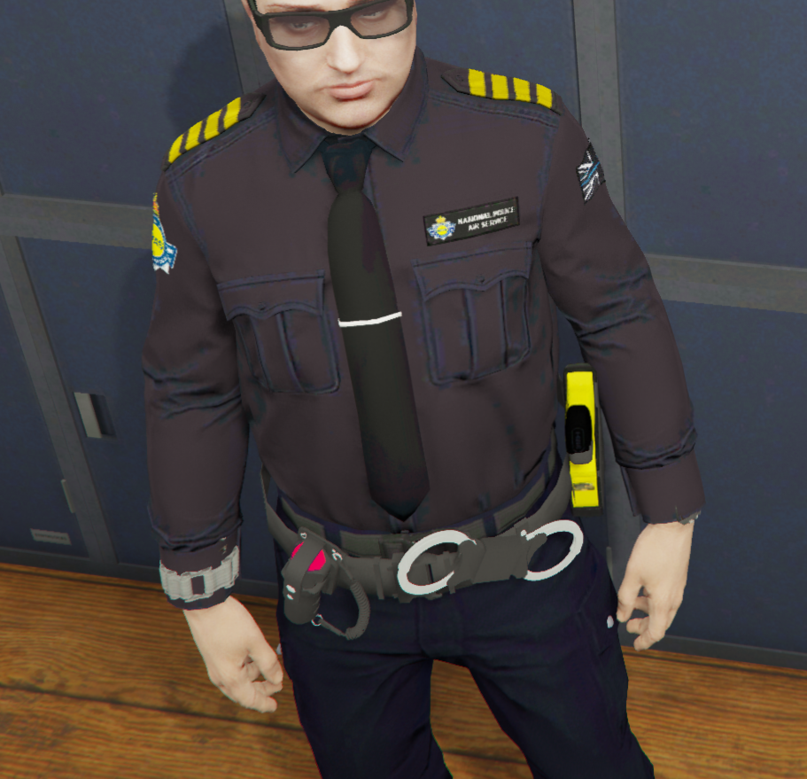
NPAS Uniform:

NPAS uniform has clear discolouration all over and looks so washed out, with artefacts all over. The tie especially just looks filthy
NavyblueEastrussiancoursinghounds%F0%9F%8F%96.png


PalatableLoon%F0%9F%A5%9D.png


Frontline - Constables Hat:

Has been compressed so the top of the hat looks "mossy". This is a common comment made by officers and people don't like wearing it due to this fact, as it isn't the black it's meant to be
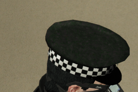
HappyKookaburra%F0%9F%8F%BA.png


Police Cap:

Same as above with green discolouration all over the hat
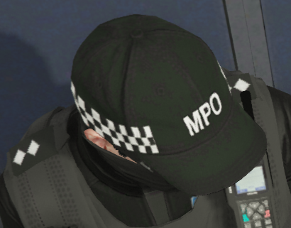
InstructiveUrchin%F0%9F%94%A9.png


Now, some of these uniforms you can see how good they used to look. Take NPAS as an example:

unknown.png


Somewhere, the quality has dipped. I would love to see the clothing restored to what they once were/could be as it's such a shame that a server like RPUK that prides itself on quality is using the lowest quality, blotchy clothing that looks it's been dragged through multiple puddles before being worn. There's other pieces I haven't included (the patrol trousers suffer from this, though to a lesser extent) but these are the most glaring immediate issues.

I have confirmed with members who don't use graphics mods that they see the exact same stuff. (https://discord.com/channels/148409679570141184/684150016062914593/1112899441989537914)

Oftentimes when brought into shaded areas, the uniform looks acceptable, but when stepping into the sun, these issues are painfully obvious to see and comments are sometimes given by users

 
I've noticed this issue too, would be nice to have all uniforms looked at, double checked and fixed assuming it's a bug.

 
Thank you for your help in alerting us to this bug, now that all of the required information has been gathered, it's been logged with the development team who will look to fix this. ​

200.gif

Thread locked, awaiting development team response
 
Could you save me some time and show me exactly what menu each of these is selected from, and their relevant positions. Things are scattered around the code in various number systems and it's not always easy to correlate, so if I can see their exact entry in their locker menus, I can zoom in and find them by a quicker method (I think).

FWIW the compression is not 'overzealous' @1000Phoenixand I'm sure you didn't mean to trigger me by making such an apparently judgmental claim... 😉 

The compression-method in use will be one of DXT1 or DXT5 DDS which is the standard Microsoft DirectDraw S3TC block-compression algorithm and there are no alternatives that GTAV's RAGE engine can use (other than no compression at all, which is a no-no because of the way it hogs video-card VRAM needlessly and causes far worse problems than tinting).

The problem with the algorithm is as old as the algorithm itself (it originates from some code that was made in the 1970s, but in its current form, it was included into MS's DirectX technology in the 1990s and is largely unchanged). It affects everything (because it's a lossy compression algorithm that literally 'loses quality' as a byproduct of making it smaller), but it's more noticeable on fixed washes of single colour, and especially grey or black-tones where the slightest single-leve boost or dip in the green-level will tint any area using that colour to either take on a greenish tint (boosted G) or purple tint (dipped G, giving rise to a relative boost in R and B, which makes purple).

Clearly these ones have at some point slipped through the net, or may even have been recompressed recently (I'll find out) - because we've been desperately trying to regain some VRAM back, due to the phenomenal numbers of textures we have in use for clothing at the moment.

If we're lucky, it can possibly be remapped from the texture-data we already have (but this can sometimes be sub-optimal, because you end up creating something that already has 'baked-in' quality loss from the previous compression and save). Ideally, if we have the original uncompressed 32-bit RGBA texture we can start from a fresh source, and tune the exact shade of black/grey to use a colour that does NOT suffer from green/purple tinting (it all depends on the compressor plugin in use for a given art-package, sadly. Nvidia's compressor behaves slightly differently to GIMPs, and there are about 10 different compressor implementations all with slightly different 'risky' colours').

It can sometimes just boil down to trial and error. In other cases, when we crack open the model and see what's inside, we encounter a shitpile of badness - lack of mipmaps, incorrect resolutions, wasteful use of UV maps, or just plain inefficient colour mapping where a massive expanse of texture data is referenced instead of a single 4x4 square tiled repeatedly. When we get those, oftentimes it's better just to start the fuck over, right from the 3D model downwards, and re-do it properly.

It's a sad fact that a lot of freely available custom content falls into this category, and is not up to par. We're only really starting to get deep into this kind of stuff now that we have a couple of experts on the team who have the right skills and know the tricks and pitfalls. Up to now, we've tended to 'fulfil a basic need' (for uniforms) and not always had the skillset nor the time to attain perfection. But it's a constant goal.

If you're interested, there are many resources out there which document the green/purple tinting problem that affects primarily greys and blacks in DXT/BC compression. Here are a few: https://www.modding-forum.com/guide/3-texture-compression/ https://developer.valvesoftware.com/wiki/Fixing_DXT_Green_Tint_Compression https://www.modding-forum.com/forums/thread/841-safe-dxt-greyscale-color-palette-for-photoshop-illustrator/

Like I said - let me have the exact uniform menu references and I'll go dig a bit deeper and see what we can rescue.

 
Last edited by a moderator:
UPDATE -

I've found the first two - the PSU Riot uniform, and the Formal with Tie (NPAS I think).

The texture immediately makes me want to vomit. 😞


It's 3048x1524 pixel resolution, has no mipmaps whatsoever, is stored in DXT5 even though it does not use a single fucking shred of Alpha data, and yes, has a green-tint, and worse, we do not have the original black uncompressed texture.

So to fix this properly, it's a complete rebuild.

 
Like I said - let me have the exact uniform menu references and I'll go dig a bit deeper and see what we can rescue.
Sure- In order of the images above (from top to bottom), they are

Riot | Uniforms -> Riot Uniform

NPAS | Uniforms -> NPAS Uniform (+ NPAS Uniform - Advanced & NPAS Uniform - Command)

Peaked Cap | Hats -> Frontline - Constables Hat

With the Peaked Caps, it may be pertinent to point out that I have previously suggested and offered to purchase, for the server, a far higher quality hat (and higher quality vests approved by PolCom) that shouldn't have this issue and is something that people would want to wear, further allowing us to incorporate rank notation, which I think is always something people look forward to during their career advancement on the server, however it got shut down in the past when brought up to yourselves. If the hats, too, require a full rebuild, then I ask for this to be brought back into consideration. I am still willing to fund this and should take a lot of work from yourselves to allow the server some high quality assets for the police you see around all the time.

Baseball Cap | Hats -> Police Cap

The police caps affect all variations as a few caps use the same model with modified text.

There are other pieces of clothing that suffer to a lesser extent (such as the Clothing -> Service Trousers), but I'm aware what's been provided already is quite a job.

 
Last edited by a moderator:
I should restate - the PSU & NPAS uniform wasn't always like this. Something changed a few months ago with them.

The baseball cap & peaked cap have always been like this, hence the request a while ago for better assets.

 
Status
Not open for further replies.
Back
Top